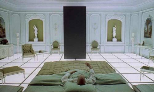
Why Did I Put A Sofa on My Spaceship?
- Uncategorized
- June 1, 2023
My partner has often bemoaned that I will spend hours travelling from openworld shop interface to openworld shop interface, carefully browsing the inventories of each NPC, to assemble the perfect outfit in a videogame, while in real life I will spend the minimum possible amount of time selecting “something grey” to cover my nakedness with.
At the same, my brain struggles to engage with selecting furniture and furnishings for the place I actually live in, but I am endlessly fascinated with interior design on spaceships. One of my favourite articles I’ve written is a deep dive into the design of spaceship hubs in videogames– give me the universe to explore and I will 100% go and check out the kitchen.
I’ve interviewed the person who designed the bridge and Captain Pike’s quarters on Star Trek Strange New Worlds, I’ve written at length about the influence of Alien’s blue collar industrial spaceship aesthetic, and about why there is such a Venn diagram crossover between spaceship interiors and gameshow sets.
So it’s no surprise that one of the best bits of writing Fermi’s Progress was intricately plotting out and imagining the entire internal spaceship layout and décor.
Now, the best part of any spaceship is, obviously, the kitchen (It’s only a matter of time before I write an article about spaceship kitchens), but almost as good as that is the bridge. It’s not always called the bridge. Sometimes it’s the cockpit, the control room, the “CIC”. On board the Fermi it’s called the Situation Room.
The point is, it’s the big exciting room where the action happens.
Both Kinds – Country and Western
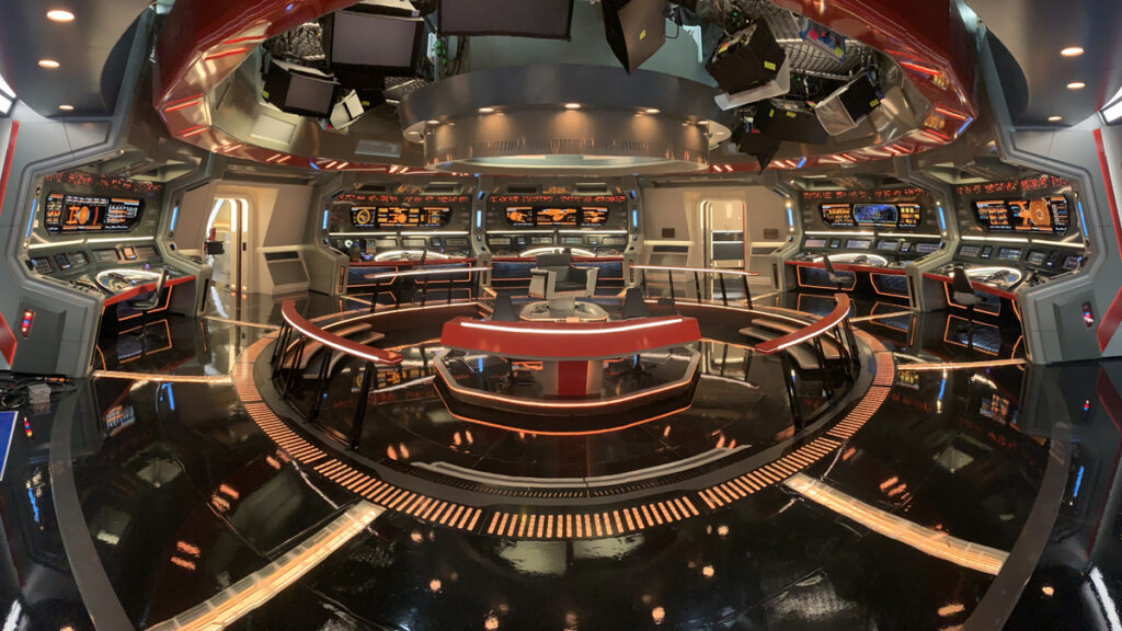
The thing is, they are also nearly always kind of samey. Most of the time bridge will come in two flavours. The first is there is a big armchair or office chair pointing at a giant screen while other people sit at computer consoles in front and behind it. The look was pioneered by Star Trek’s Matt Jefferies, and has been replicated ever since across the Trek franchise. But you can also see it in Stargate, both in the US military’s secret navy of starships like the Prometheus and the Daedalus (great names guys, no horribly ironic fates coming for them, no sir), and in the ancient-aliens-built “Destiny” that Stargate: Universe is set on board.
It’s the layout we’ve seen in Galaxy Quest and Gene Rodennbery’s Andromeda and Paul Feig’s Otherspace and Black Mirror’s “U.S.S Callister”.
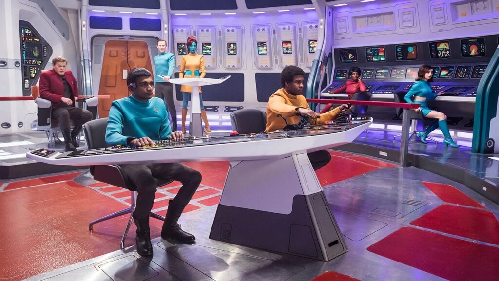
Of course, if you don’t want your spaceship to look like a Star Trek homage, the alternative is usually “an aeroplane cockpit but bigger”. This what we see in Red Dwarf’s Starbug, Firefly’s Serenity, Killjoy’s Lucy and the various named-for-80s-pop-icons ships flown by the Guardians of the Galaxy.
While the Fermi has a cockpit (taken from the Soviet-era Buran shuttle), that’s not where I wanted the action to be, and I didn’t want the room where the action is to look like a direct Star Trek rip off either (because let’s face it, I was already walking that line).
So in imagining the Fermi’s control room, I had to ask “What is this room actually for?”
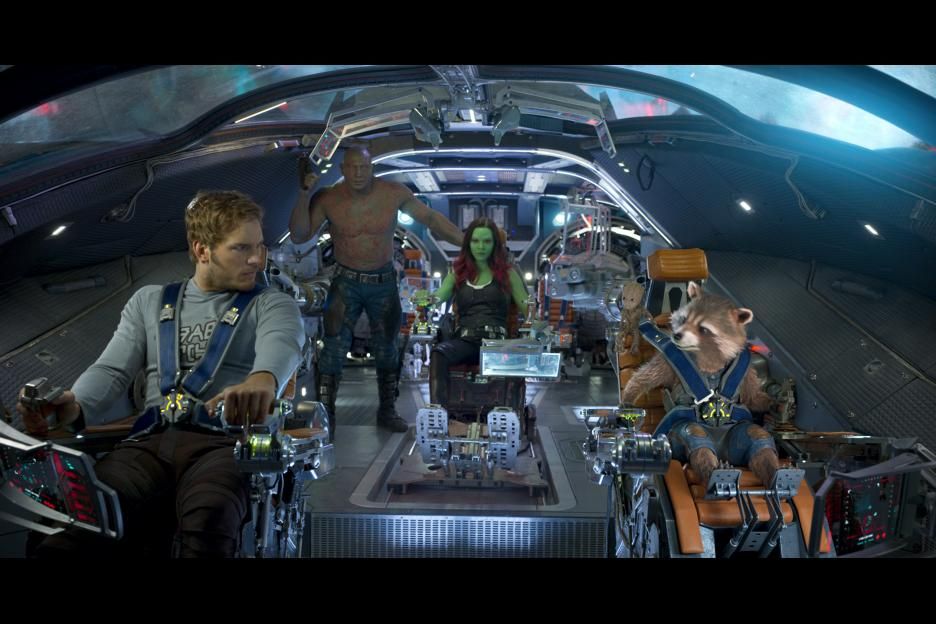
The Room Where It Happens
Your control room will serve a few functions. First, nominally, it is where you fly the ship. It’s where you put the big steering wheel that turns the ship around. This can range from Star Wars-y World War I dogfights in space territory, to sitting at a desk where you point and click the onboard satnav and let it self-drive to its destination in exactly the way that Teslas don’t.
The former can be exciting (although not really what the Fermi is going for), the latter is, well a lot of sitting looking at a late-nineties Windows screensaver- not even one of the good ones.
Secondly, and more importantly, it’s where you look at stuff when you get to where you want to be. You use your “sensors” (with Fermi I tried to keep to using LIDAR or, where possible, cameras rather than “magic knowing computers”) to learn what sort of mess you’ve dropped into.
You take phonecalls (this is a surprisingly crucial part of the role of a starship bridge) and, most importantly, you all look at a big screen.
In real life space travel, the room that serves the function of “the bridge” isn’t on board the spaceship yet, because we’ve not built one big enough or that goes far away enough to need it there. It’s NASA mission control. Look at it, banks of computers looking at a giant viewscreen, loads of people accumulating data to deliver to the person in charge in a timely manner.
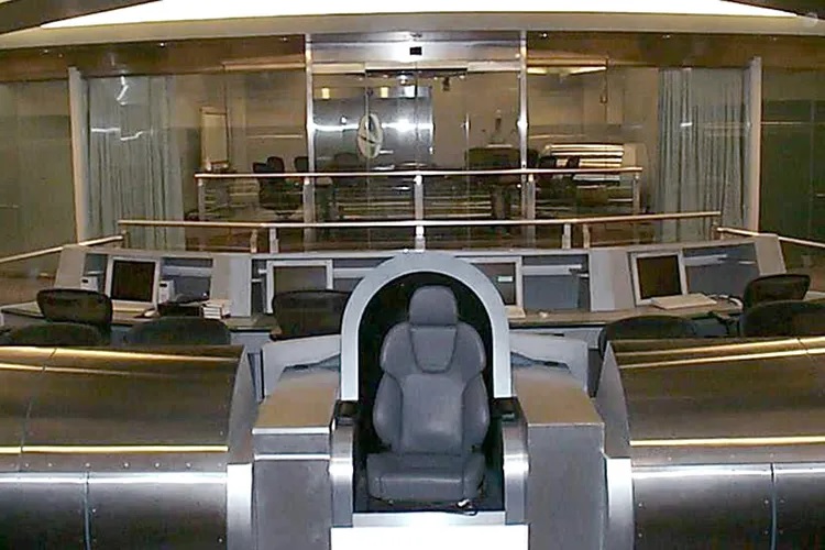
In fact, the closest equivalent to the Enterprise bridge in reality, quite deliberately, the NSA’s “Information Dominance Centre”, which is straight up using the sinister dystopian apparatus of the US military intelligence industrial complex to cosplay.
For quite a few drafts, nearly to the very last one, the Fermi’s bridge was called “Mission Control”, and when it was renamed to “the Situation Room”, it was still meant to evoke that feeling.
Are There Living Rooms on Mars?
But piloting a spaceship aside, we spend an awful lot of time in a room like that, where we take phone calls, sit in big chairs and look at a big screen. It’s our living room. Indeed, on the TV shows we’ve talked about, the bridge set performs the same function as a sitcom sofa.
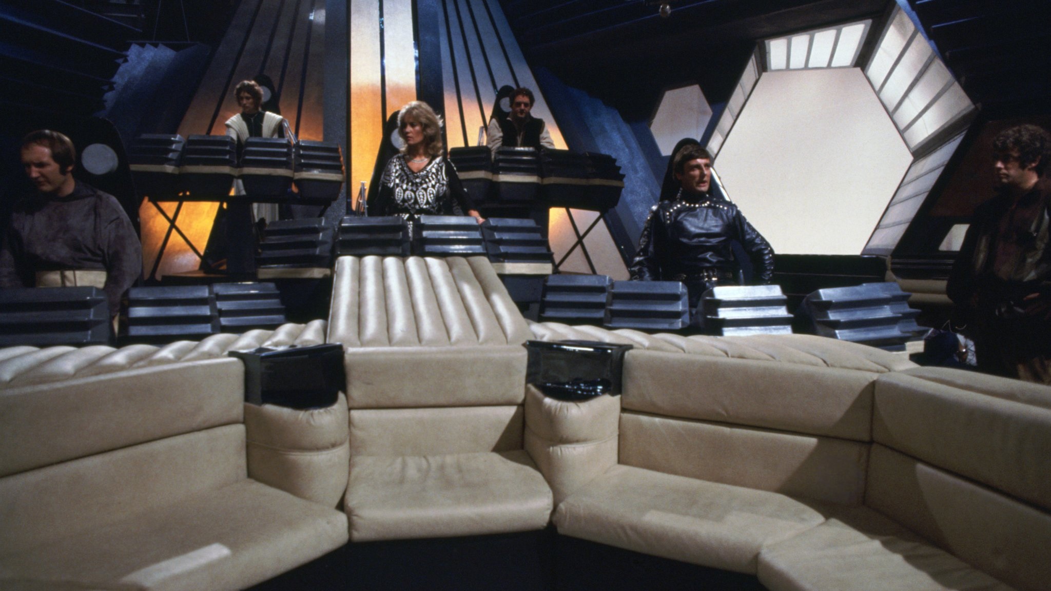
That, for me, is what unlocked the “Situation Room” that served as the Fermi’s bridge. It is why I relentlessly refer to the room’s giant screen as “the big telly”. That was also why the room came furnished with a “command sofa”, a giant, C-shaped sofa for the crew to lounge around on and argue.
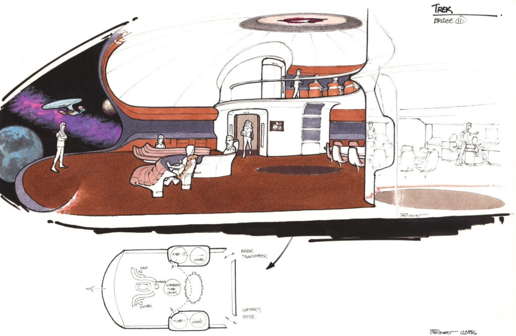
It wasn’t until recently that I realised I was not the first to hit upon this fundamental truth of spaceship designs. Andy Probert’s briefing when he was tasked with designing the Enterprise bridge for Star Trek The Next Generation was to create a “spacious, living-room-like control centre”.
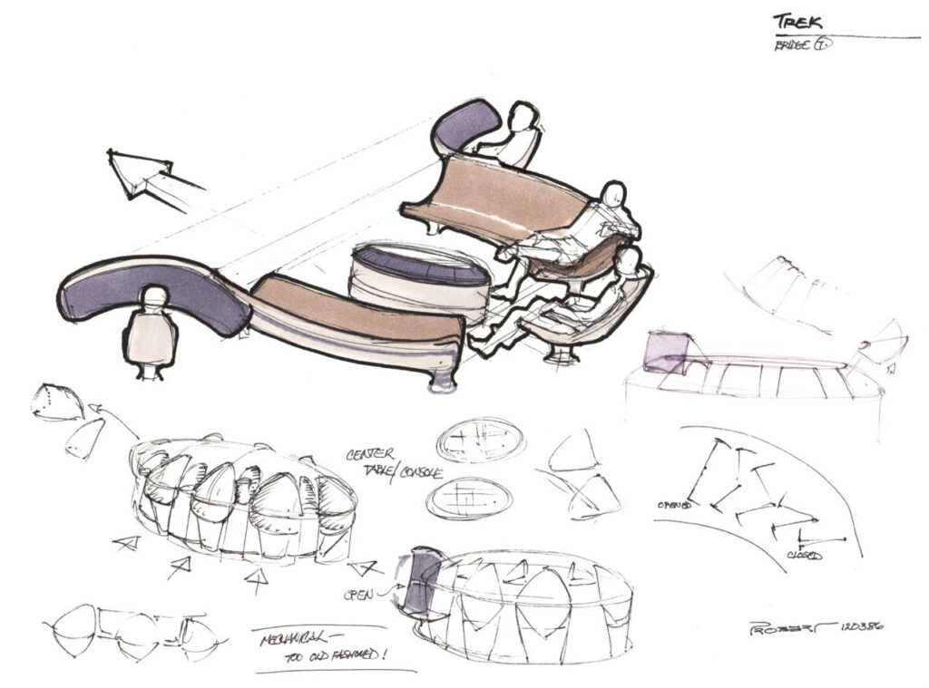
And if you look at some of those early drawings, many of which are far more adventurous than the standard “Big Chair Pointing At A Telly” formulation, sure enough, there’s a giant C-shaped command sofa in the early drawings.
So there’s some parallel evolution going on here, but also, as with all great innovations, a healthy amount of outright theft. It wasn’t until I went back to rewatch Blake’s 7 a while after finishing Fermi’s Progress that I realised they too had a giant, C-shaped command sofa in their control room, and that this is probably where I took the idea from.
And it comes back to looking at what the bridge is for. There’s a reason that the Fermi, Blake’s 7 and yes, even Star Trek The Next Generation all went down the C-shaped sofa route, while the original Star Trek had its giant armchair, and (TNG’s dalliance aside) its spin-offs followed suite (apart from a brief, and in hindsight, problematic “two command chairs” layout on the U.S.S. Voyager).
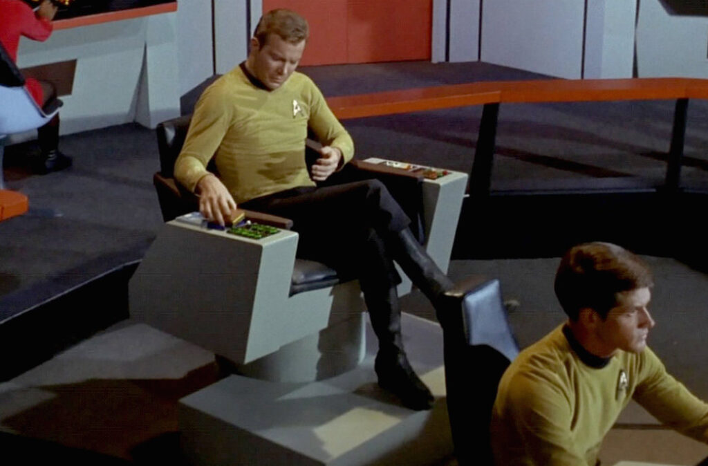
Star Trek, original flavour, is a show about a hero protagonist, leading a cast of characters into adventure. While the ensemble is why we love it, there was never any doubt that Kirk was the main character, and the man whose decisions mattered. In the Room Where It Happens, he is the man in the centre of the room that it is happening to.
Roj Blake is no Kirk (as one of the writers novelising Blake’s 7’s first series said, he’s a pretty terrible leader all round). Where Kirk makes a decision and his crew faithfully carry it out, Blake makes a decision and then everyone argues about it, and the C-shaped sofa is designed for that precise purpose.
When writing Fermi’s Progress, I also tended to think of the ship, and its crew, as a “flying argument”. The Situation Room is laid out to facilitate those arguments.
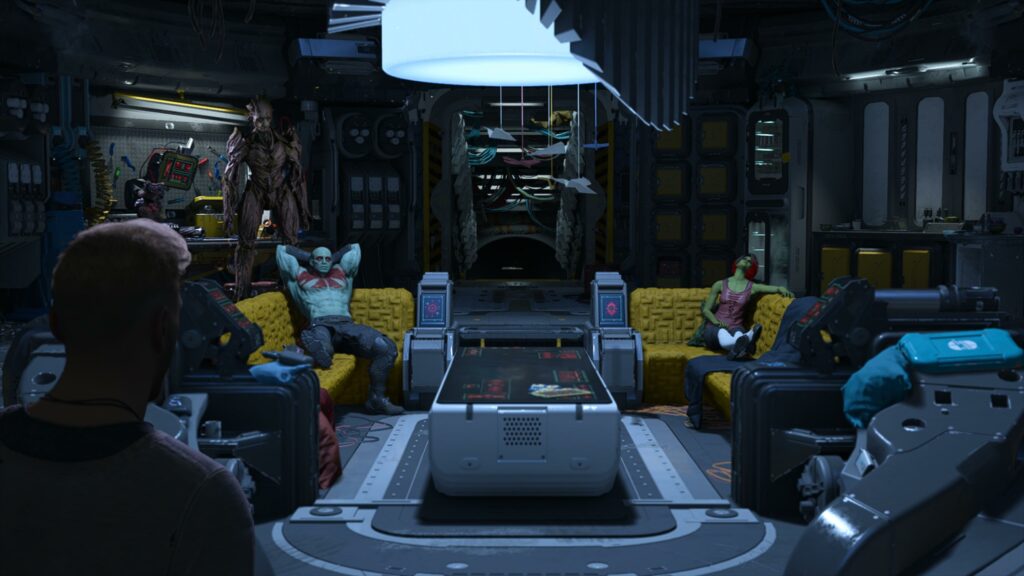
The Guardians of the Galaxy videogame features a spaceship with the “giant cockpit” bridge layout, but behind that cockpit you’ll find a big C-shaped sofa in the living room, designed for arguing on.
And even in the idyllic, no-conflict world of Rodenberry’s 24th century, Star Trek The Next Generation left behind Kirk’s more dictatorial style in favour of endless conferences and debate (which is what makes it brilliant). The C-shaped command sofa is gone, but its ghost is still there in the command chair/first officer/ship’s counsellor set up we know and love.
Fans of spaceship interior design (that’s me, I’m the fans) were recently treated to nerdy Interior-Design-Christmas when the Rodenberry Archive dropped a complete set of every Enterprise bridge, including a bunch of never-seen concept art versions, on its website. Complete 3D models were presented for you to wander around and explore.
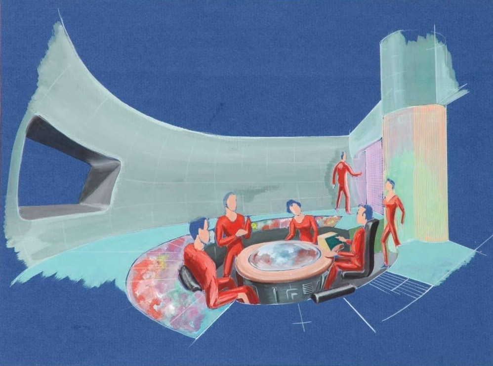
It included my personal favourite Enterprise (and one of the reasons the Fermi’s warp, ahem, “Alcubierre” drive is a giant ring), the XCV-330, which was great because I’ve been chomping at the bit to have a nosey around in there for years. Its bridge was based on a very early Matt Jefferies design for the original Enterprise. There is a Big Telly, or possibly a narrow window, and there is a command chair. But rather than lots of forward-facing command consoles, there is a single round table for everyone to sit around.
It is annoying, but kind of comforting to know that once again, we are all just rooting through Matt Jefferies’s cast-offs for ideas, but you’ve got to wonder how Star Trek might have turned out if TOS had gone down the flying argument route.
Chris Farnell’s novel, Fermi’s Progress, about a prototype faster-than-light spaceship that destroys every planet it encounters, is for sale now at Amazon and Scarlet Ferret (which is more ethical, includes bonus extras, and frankly, gives him more royalties).
He is also the author of the Star Trek Lower Decks U.S.S. Cerritos Crew Handbook, which is available for pre-order now.


